Introducing the new look of the LA Kings!
With the help of those who directed the new look, and those who physically made it, providing the key details into how the Kings ultimately reached the logo we see today, a new look forward for the organization going into next season and beyond, crafted from a process that took more than two years.
Included here is a podcast with myself, Jesse Cohen, Kelly Cheeseman (LA Kings COO) and Andy Cruz / Jonathan Dupree from House Industries, the firm responsible for ultimately creating the logo(s) you see before you. The full podcast is a detailed and informative listen, embedded below. Not the shortest listen of your life but there’s some cool info within.
Now, we give you the process.
It’s been two years in the making, here’s the behind the scenes look at how the Kings organization ultimately settled on the logo you see today.
WHY
The why felt pretty simple, at least when broken down by Kings COO Kelly Cheeseman.
“The players spoke and the fans spoke,” he told me.
By the players, Cheeseman was referring both to players currently on the team and team alumni, a group that has played in a wide variety of different logos, jerseys and brands over the years.
For the Kings, player support and player input was important in the process. Getting the guys actually wearing the jerseys to buy in was an important first step. When several of them were polled, formally or informally, the feedback from that group was pretty direct and clear. Players were continually drawn to this mark, or at least a version of this mark, and those still with the team would be excited to wear it going forward.
The current group has worn two iterations of their 90’s era look – a straight throwback in 2019-20 and 2020-21 and what we’ve referred to as the “Chrome Domes” over the last three seasons, with an alternate jersey wearing a variation of the mark we’re seeing today.
Thankfully, the feedback from the fans was saying the same thing.
For Cheeseman, he said it started when the organization introduced the 90’s throwback look now five years ago.
Positive fan feedback rolled in and in some ways, money talked. Merchandise sales surrounding that mark specifically skyrocketed and feedback from the fans, via focus groups and other areas, showed that the fanbase is drawn to the logo that Kings wore for select games across those two seasons. Additionally, the feedback on social media that the team received regarding the look and feel of the team was overwhelmingly positive. This for a team that performed quite poorly on the ice that season. A breath of fresh air, perhaps, but the feeling towards that variation of the Kings logo persisted into the alternate jersey we’ve seen over the last couple of years.
“When we dropped the 90’s heritage jersey that we were going to wear on the ice for the first time in a long time, and we unveiled that really cool video that went out, and it was wildly popular by the fans that it was going to come back, and then COVID happened, put a complete pause on it, but we saw the popularity and demand for that brand and jersey,” Cheeseman said. “Then, during that period, we transitioned into a new merchandise direction and look and feel and the fans spoke and the players were wildly excited about wearing that jersey. I remember Dustin Brown saying that’s my favorite jersey, Anze Kopitar saying that’s my favorite jersey. So, the fans spoke, the players spoke, so thus the journey started. We went through the exploration of refreshing looking at what the new look would look like.”
There was no specific “direction” going into this process, but as feedback came in from so many different areas, the path forward became clear. The “Gretzky-era” mark was the basis for the process, with changes bringing that look to the modern era.
WHY THIS.
The feedback felt clear, but were there other options the Kings could have taken?
Why not purple and gold? Why not keep the chrome in play? Why not just a crown? Why not a new logo entirely?
All valid questions.
There were certainly other options considered along the way, as a part of hundreds of different mockups, sketches, ideas and concepts. The approach was wide ranging, with all of the questions you might be asking considered. We all saw how great the Reverse Retros looked. We’ve seen other teams create new marks with varying ties into team history and legacy. Some have worked and some haven’t.
First and foremost, it ties back to the central theme. Fan and player feedback said the same thing. It’s like making a draft pick when your scouts and analytics team are in agreement. Means you’re on the right track.
For the Kings franchise, there have been three moments in history that have drastically altered the road of the franchise from a branding perspective. The first was the launch of the team in 1967. The second was the shift in color scheme to the black, silver and white palate we see today. The third was winning a championship, followed by a second championship. When you win, you don’t blow up the look, you lean into it, as the Kings did. Logos have changed throughout the history of this franchise, with different marks, different styles, different applications. It was the shift to the black, silver and white, though, in the 1980’s that provided a true pivot organizationally from the look we saw from 1967 – 1988.
At that moment, the Kings made a drastic shift in color palate and logo style.
The black, silver and white has represented the majority of the key moments in franchise history, including both championships and all three appearances in the Stanley Cup Finals. The Kings are a black, silver and white organization, but that’s not to say they won’t embrace purple and gold down the road. They will.
“It’s an important part of our heritage and we’re not scared to use it,” Cheeseman said. “We’re a black, silver and white team, but the [purple and gold] is a part of it and we can continue to use it maybe in specialty moments…this brand has the flexibility to adapt to that and use that.”
For the Kings, the approach they took is that “legacy drives us forward”.
What you’re seeing today is not a straight throwback but there are obvious ties to the organization’s history. Some eras more than others, as you’ll see below. There are obvious pulls from the look the team wore when Gretzky played here but there are also nods to several different eras in the final product. Where feedback ultimately led, though was the direction we’re seeing today.
“As we really zoned in on all the different factors and the research that we did with fans, past alumni, players, past wives……the two things they wanted was the Gretzky era and the original crown, those were the two most important things,” Cheeseman said. “So then it got to, we wanted it updated and they gave us different iterations of it and we looked at all the history of it……it got down to the 90’s heritage, Gretzky-era heritage, was so good, don’t mess it up, but let’s update it and that’s where we landed.”
WHY NOW
The reasons as to why were what drove the decision.
The why now, while less important, do position the reasoning behind doing it now as one that makes sense.
The biggest “why now” is that feedback received in 2021 is finally being realized now.
Honestly, I think there’s a different world where this was done sooner. We live in this world, though, one with challenges and hurdles, and the decision to do it now, this way, makes sense.
It’s crazy to believe but it’s a two-year process to get from decision to final product. Longer really, from initial planning to formalization to final product. The reason behind the NHL’s two-year timeline actually relates to the Kings, when they rebranded back in the 80’s, switching the colors to the current black, silver and white collection. The team rushed that timeline to line up with the acquisition of Wayne Gretzky. In listening to an interview with the late, great David Courtney, he said that the two-year notice was put in place by the NHL as a result of the rushed nature of that initial Kings rebrand. Now, processes like this take time by league mandate.
As for why the timeline began when it did, the 2021-22 season was essentially a reset for the Kings, both in terms of the team on the ice and the business. The Kings initially reintroduced the retro look back in 2019, but the second half of that season was cancelled, followed by an impacted 2020-21 campaign. Coming out of a season that was largely spent without fans, the focus was on getting the business back on track. The same was said on the ice as the team returned to the playoffs for the first time since 2018.
Then came the work.
Nearly two years ago today, in June of 2022, the Kings officially signed a contract with House Industries to begin work on the construction of a new logo and brand. I think the why has been well-documented, but as for the why now? Two additional factors went into play here.
One, the NHL announced a new partnership with Fanatics, replacing Adidas as the official jersey provider of the league beginning with the 2024-25 season.
With that meant changes anyways, including the limitation of teams to just home and away jerseys for the 2024-25 season only. It also represented a natural fork in the road for the Kings organization, which had its eyes on changing the look anyways. Did it make sense to wait another season with the restrictions that would have forced this mark out of the uniform mix until 2025-26? Or did it just make more sense to do it now? Certainly feels like the latter.
There’s also the status of Crypto.com Arena, with the Los Angeles Clippers set to move into their new home this coming season in Inglewood. With that comes Year 3 of renovations throughout the arena, including many changes that would involve the team’s primary logo. Again, did it make sense to do all of those changes with what essentially would have been, for lack of a better phrase, a lame-duck logo? Not particularly.
“The renovations were a key feature, that’s why we really pushed the league that we’ve got to be one of these first teams in the Fanatics wave that get it because we’re going through major renovations,” Cheeseman said. “Those have altered and changed, timing-wise. We were supposed to have a new locker room this year at Crypto, that is not going to be until the following year, so things change, they evolve as they happen. The last four years for sure, but that was a big factor.”
The why is simple. The fans and the players spoke. The why now had more wrinkles to the process, but when you put all of those different factors into play, the timing couldn’t have been much clearer.
HOW
The how is where House Industries came into play.
Andy Cruz, a co-founder of House Industries, was described to me as the Michael Jordan of the design community.
House Industries has worked with Green Day. They’ve worked with Jimmy Kimmel. They’ve worked with Lucky Charms. Countless big brands and experience with creating and building brands that are seen on the brightest stages.
There’s a standing relationship between House Industries and the Kings and they became the perfect partner to help build a new brand for the Kings. What started as an open assignment began to come more into focus throughout the course of the process.
“We’ve thrown around rebrand, refresh, update, but I think when you really get down to it, it is rethinking, pieces, elements, part of the visual legacy that was there,” Cruz said. “How do we look at that, not only through the House Industries lens of a little hug here, a little cleanup here, but also making sure that the team and the leadership [with the Kings’ understands what we’re doing and ultimately trusts us with with their baby.”
The process and communication between the Kings and House Industries was extensive. As noted above, there were hundreds of concepts, sketches, drawings and renderings. In so, so many different directions. That’s what a company like House does. No stone was left unturned in the planning process, even when all roads eventually led back to the basis of a mark that we are familiar with.
WHAT’S CHANGING
So what is actually different?
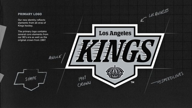
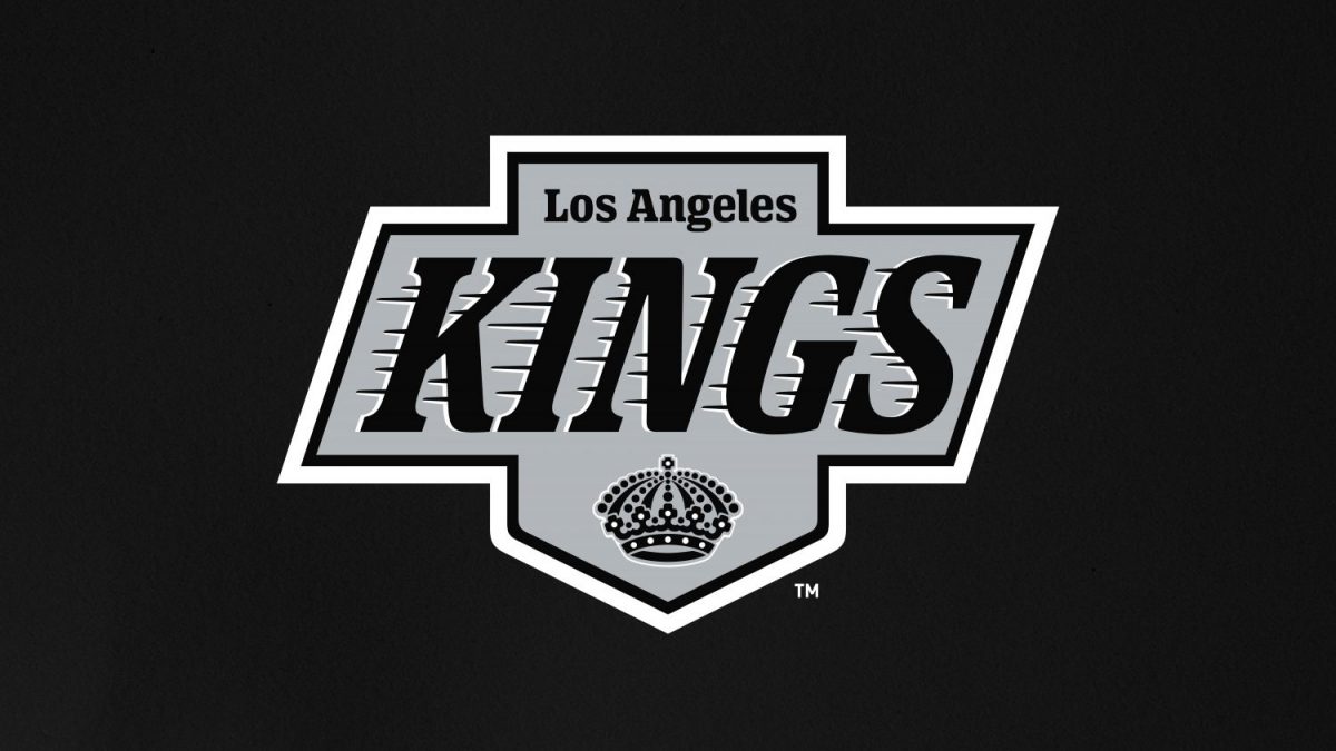
You saw the same leaks that I did. Even if you simply posted the old logo, you’d be like 80 percent there. None of the leaks posted were actually fully accurate, though. There were four key areas identified for change – the shape, the crown, the KINGS font and the Los Angeles font. If you do a side-by-side between the mark we see today and the original, you’ll see change in each of those four areas. When the jerseys are eventually released, there will be more changes to come, but in the here and now, there are these four, key areas of difference.
CROWN
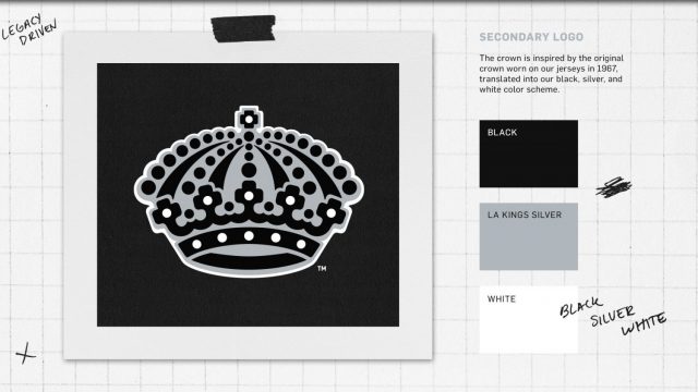
The crown is a modified version of the original, 1967 crown, a nod to the origins of the franchise, but with a modern approach.
A return to a version of that crown is something the organization saw via the feedback they’ve received over the years. It was a no-brainer to work this crown into the new logo.
The version we’re seeing today is a simplified version, but the process of getting to this final crown was anything but simple.
“When you go back to the the early crown, it was always multicolor, so the first thing you’ve got to do is break that down to one color and by doing that, it just presents a whole new landscape of what we call color problems,” Cruz detailed. “Not color like multiple colors, but like when you look at something black and white, there’s a density to how much black and how much white there is and that’s what we use to start to measure, okay, if it goes big, it goes small, should there be more jewels, less jewels, is it getting bunched up, loosen it up, so that was the real color issue that we had. Not so much the final production, what the color looks like on a garment, but the color of the crown itself, the silhouette. Once we solved that, then it was okay, are they multi crosses, are they round corners, are they sharp? Is someone going to think that this is British royalty or Danish royalty, so you’ve got all this baggage that comes with the “royal” aspect of designing a crown.”
Cruz added that he and his team designed more crowns than they did logos. The crown is an exceptionally important piece to the identity and brand of the Kings. Certain details were not finalized until there was the ability to see how they looked on a jersey or a piece of merchandise. Arguably the most important “detail” within the process and perhaps the most time consuming piece of the overall finished product.

SPEED LINES
Speed lines. So hot right now. Speed lines.
“The speed line thing is funny, because we always knew that was a key element to this, but we had to, again, do a little re-engineering when we got to the apportionment program,” Cruz said. “There are a lot of fussy little bits involved in those speed lines, but again, prototyping testing and really just throwing it on the table versus talking about it, I think that’s what really sort of got things down to a place where we could say, ‘okay, now we’re ready to see what this looks like in real life.”
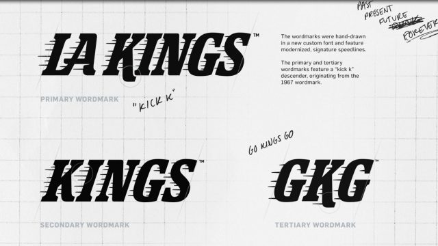
Cheeseman added that the speed lines became something that has become affiliated with the LA Kings. When you see the speed lines, you think Los Angeles Kings. I know I do. They’re an important brand identifier.
When reimagining this logo, the speed lines became an important feature that the Kings were keen to hang onto. They’re reflected in a new way in the new logo. Lots of technical talk in the podcast, if you’re into that sort of thing, on how we ultimately got to the place that we did in the final version. There’s also a 26-letter font to be used going forward. No longer are we limited to KINGS. I look forward to seeing DOOLEY in speed line font.
FONT
The speed lines are what your eye is drawn to, but there are actually two fonts within the logo – the font that says KINGS and the font that says Los Angeles.
The KINGS font on the original mark is iconic. The speed lines will be forever associated with the Kings brand. There’s also the other component, though, which is the Los Angeles at the top.
In speaking with Dupree, keeping “Los Angeles” in the logo was a way to work the city name into the logo. It was always there, yes, but this is not the exact same mark from the 1990’s. There are changes and there was room and opportunity to make further changes if desired. Ultimately, although several different approaches were taken, the decision was made to go with a unique font for Los Angeles, while keeping that portion of the logo the same in terms of having both Los Angeles and Kings within the primary mark.
“There was some art to that original one, with the the upright versus the the italic,” Cruz said. “In your head, you’re thinking, italic, it’s fast, but we ultimately did kind of come back to doing that upright, which ultimately informed the two different versions of the of the font as well. A lot of times, you get into these things with with aesthetic intentions and then you realize, through the process, that certain solutions, you know, they ultimately present themselves by just kind of going through the paces.”

SHAPE
You might also notice the shape of the logo is slightly different.
It is actually a more drastic look with the logo online than we’ll see with the jerseys, which are coming soon.
The slight change in shape is a nod to the outgoing jerseys. The homeplate or shield logo is what we know right now. It’s the logo the Kings won in twice. It’s now a part of the mark going forward, featured within a slightly wider middle of the logo. If you overlay the shield over the top of the new mark, it would fit in perfectly, while also making the mark feel more balanced. A win-win.
Shape is listed last here because it came behind the crown and the fonts in terms of the design process. How the crown looked and how “KINGS” was ultimately represented were more important in the grand scheme of things. The end shape, though, is important as well.
“We didn’t even get to the silhouette, the shield, if you will, until we nailed the type,” Cruz said. So, it was like, let’s get that sorted out first and then the shield was fairly established, and we figured, okay, once we we nailed down the look and feel of the of the word “Kings” then everything else can be built around that.”
There’s history and success in that shield. The shield has been present in LA Kings history since Day 1, if you flip back through the historical logos of the organization. It’ll still be present today. That was an important part of the design process and widening the overall mark was a nice touch to incorporate it.

24 months and 3,306 words later, we’ve got a new logo.
There’s more to come, certainly.
Jerseys to be released sooner rather than later and again, you’ll see similarities and differences. Cheeseman noted that the jerseys “complete the cake”. The Kings have worn a straight throwback of the white jersey as well as their alternate over the last three seasons. Seeing the black jersey for the first time was powerful and I think everyone is excited for those to be released in short order. The jerseys make the logo real in print. We’ve got some exciting content surrounding the jerseys and I’m excited for the jersey release in the near future.


Rules for Blog Commenting
Repeated violations of the blog rules will result in site bans, commensurate with the nature and number of offenses.
Please flag any comments that violate the site rules for moderation. For immediate problems regarding problematic posts, please email zdooley@lakings.com.