With Adidas replacing its subsidiary, Reebok, as the National Hockey League’s jersey manufacture and distributor, teams will take the ice in 2017-18 sporting a brand new jersey design, and those new “ADIZERO” uniforms were revealed during an event at The Wynn in Las Vegas on Tuesday night. Partly because of the massive-scale operation in designing and distributing the jerseys, no teams will be wearing alternate jerseys for the upcoming season. This is the league’s first large-scale jersey redesign since the switch to Reebok’s RBK Edge jerseys for 2007-08.
First, the Vegas Golden Knights inaugural jerseys:
Both jerseys that we will wear in our inaugural season. #VGKFirstJersey pic.twitter.com/NYj3zDQmdZ
— Vegas Golden Knights (@GoldenKnights) June 21, 2017
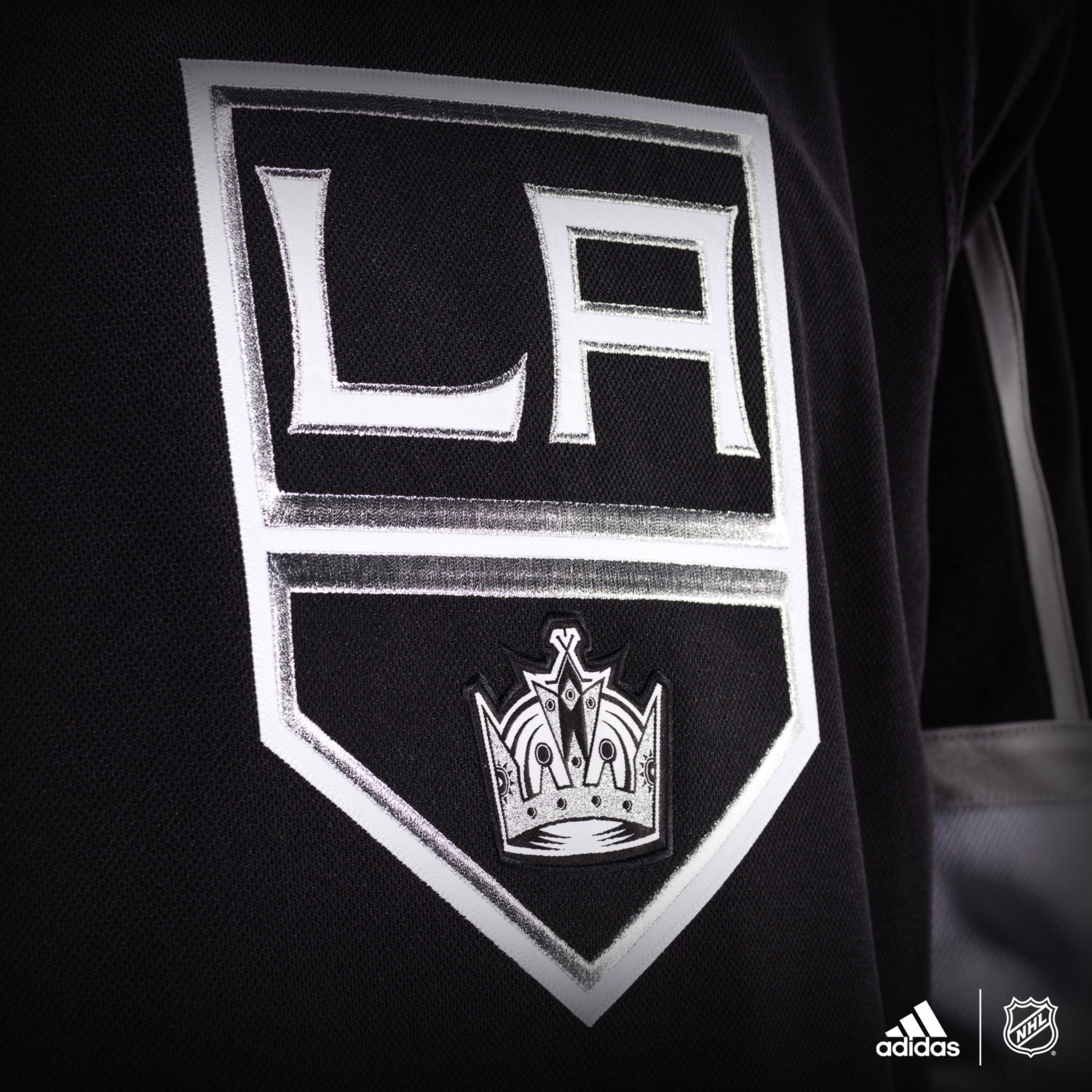
For the Kings, the changes are minor. There are new accents in the neckline and new shoulder materials, the trim (the silver piping stripe at home and the black piping stripe on the road) runs to the top of the chest instead of where the neck meets the shoulders, and the formerly silver triangle with the NHL logo below the neck is now black at home and white on the road. Use these sets as comparisons to the prototypes below.
Other than minor changes to the piping and trim and the inclusion of Adidas logos, there’s really no aesthetic change to Los Angeles’ jersey.


A release from the NHL notes that the “crest weight” has been reduced by 46%, while single layer perforated numbers reduces number weight by 60%. The jersey is 19% lighter overall. There are a lot of pinpoint but mostly meaningless percentages. The “jersey fabrics are up to 27% stronger in burst testing and up to 72% tougher in abrasion testing compared to the current NHL jersey.” The air flow circulation uses materials that are up to 133% more permeable. Whoa, slow down, scientists! Obviously, with advances in jersey construction across all sports, this will be the latest in a line of jerseys that will reduce drag and more naturally allow the athletes’ gifts to shine.
This close-up provides a more defined look at the new fabrics.


Looking at the league-wide sets, there are some positive developments. The silly, distracting trim on the Calgary, Nashville and Colorado jerseys are gone – Calgary’s primary logo remains among the best in the NHL, and their prior jerseys just had a bit too much going on, which had sort of been a trend – while nice new canvases present the Minnesota and New Jersey logos. Carolina’s new trim makes their jerseys not quite glaringly as red. The discreet red stripe on the sleeves really makes Vegas’ charcoal jerseys pop.
*checks closet*
*sees 13 LA Kings jerseys*
"Yup, gonna need the new one"@adidashockey pic.twitter.com/EgO1In91NO— #LAKings (@LAKings) June 21, 2017

Rules for Blog Commenting
Repeated violations of the blog rules will result in site bans, commensurate with the nature and number of offenses.
Please flag any comments that violate the site rules for moderation. For immediate problems regarding problematic posts, please email zdooley@lakings.com.